Announcement

Collapse
No announcement yet.

Raptors Rebrand Theory

Collapse
X
 
  • Filter
  • Time
  • Show
Clear All
new posts

  • Raptors Rebrand Theory

    Just a lil somethin I pulled out of my ass.

    So the Raptors are going to be doing a rebrand for next season and I think I know what direction they're going in due to some hints from the main social media man Jay Satur.


    For those who don't follow the Raptors on twitter they retweeted this tweet.

    Couple things I've skillfully deduced from this:

    - Red will no longer be a part of the colour scheme because I don't see any reason as to why a name change for the Raptors Red Party is necessary all of a sudden, unless there was a reason - such as removing red from the scheme.
    - Purple will make a return because the whole image has a purple hue around, which id like to think is a hint or something. Also, the raptors clearly know that the purple is popular due to the sales of the retro raps gear and because for the first time the Raptors will be wearing the dino jerseys this season.

    Next, the Raptors' twitter account profile picture doesn't use the regular versions of either of our logos, instead features the now heavily used 'claw' with a brown background.


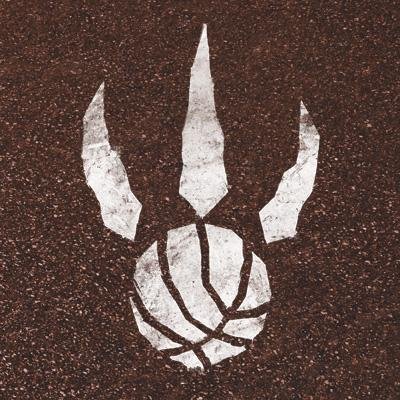
    As I mentioned claw has been used a lot over the past few years, much more over the primary logo. Speaking from personal account, I've found that people seem to like the claw better and is more popular with the fans. Probably sells better on merchandise too.
    As to why there is brown of all colours on the background I don't know because it has nothing to do with the Raptors. Of course this might also be another hint on the new colour scheme which could feature that same brown, but I doubt it. But it is pretty original so I dig that, maybe they could pull it off well.


    Last thing that comes to mind is that the Raptors youtube profile picture for the longest time had brown hardwood in it as well, but right now as I check it it seems that they've changed it to another picture that again has no colours from the colour scheme, a white claw on a background just like the twitter picture. Could be another hint, i dunno.


    ^^^^^^^^right above here somewhere is the youtube photo but its invisible because the background is white, highlight the area to see

    Lastly, the reason why I think any of this matters is because teams don;t usually mess around with the logos like this and I feel like it means something.


    So there it is, this is the type of shit that interests me and I spend my late night free time doing. don't worry, it was REALLY free time. thanks for reading, thoughts?
    Last edited by Sig; Wed Oct 8, 2014, 03:29 AM.

  • #2
    I know exactly where you are comming from, i myself personally noticed it too.
    In addition to your evidence, has anyone noticed the media backdrop cloth color has changed from Red to Black with the claws all over it. Also, the team website is inserting a lot of black theme all over the place.

    Not to mention the court design now featuring a black out of bounds area.

    I read it somewhere that the Raps have submitted an application to change their jersey which features heavy black and yellowish shades.

    we will see....

    Comment


    • #3
      the brown is part of the gritty #wethenorth campaign.

      and they already said purple will be back in limited form since its the 20th season anniversary mark.

      Comment


      • #4
        That brown is just asphalt, isn't it? Not sure it's supposed to be anything more than a playground reference, but it could indicate a colour scheme.

        I've come full circle on the claw vs. the Raptor. That claw has no personality and no soul. If the purple is coming back, the original Raptor logo should be back, too. Nothing screams "Est. 1995" like purple and a cartoon dinosaur. After nearly 20 years I actually kinda like it, for the first time.
        "We're playing in a building." -- Kawhi Leonard

        Comment


        • #5
          I don't mind if they go back to purple. I prefer red and black though.

          I've noticed that the new court designs now consists of a red and black "We The North" colour schemes. The new warm up jacket have a red Raptors claw logo on the back, new red and black practice jerseys as well.

          I hope that this is a trend that they'er leaning towards a red and black colour schemes.
          Mamba Mentality

          Comment


          • #6
            I would prefer any combination of black/red/purple to anything that involves just black/white or black/gold.

            The minimalist designs are just as trendy today as Jurassic Park was 20 years ago. Have we learned nothing? I want a re-brand that will embody the Raptors franchise past, present and future, with a classic yet nostalgic design.

            black & gold - I get the idea of using Drake to appeal to the NBA fraternity and fan-base, but the team is not the Toronto Drakes or Toronto Ovo

            black & white - ummm... how cheesy and embarrassing would it be to go from "Fuck Brooklyn" to "Fuck, we just copied Brooklyn"? black & white is fine for the "We The North" campaign, but not a full Raptors franchise re-brand

            Comment


            • #7
              ball4life wrote: View Post
              I know exactly where you are comming from, i myself personally noticed it too.
              In addition to your evidence, has anyone noticed the media backdrop cloth color has changed from Red to Black with the claws all over it. Also, the team website is inserting a lot of black theme all over the place.

              Not to mention the court design now featuring a black out of bounds area.

              I read it somewhere that the Raps have submitted an application to change their jersey which features heavy black and yellowish shades.

              we will see....
              Ya good stuff, these are also some things I've noticed that I forgot to mention. They're using the red a lot less.

              The application I did not hear of though

              Comment


              • #8
                S.R. wrote: View Post
                That brown is just asphalt, isn't it? Not sure it's supposed to be anything more than a playground reference, but it could indicate a colour scheme.

                I've come full circle on the claw vs. the Raptor. That claw has no personality and no soul. If the purple is coming back, the original Raptor logo should be back, too. Nothing screams "Est. 1995" like purple and a cartoon dinosaur. After nearly 20 years I actually kinda like it, for the first time.
                I don't mind either logo but the primary Raptor one could use a redesign with a similar appearance. For example those triangles up top don't really make as much sense anymore because they were originally used also on the jerseys, so it matched up. But now it doesn't really apply to anything.

                I like the Raptor and I hope they feature one on the new primary

                Comment


                • #9
                  TRex wrote: View Post
                  I don't mind if they go back to purple. I prefer red and black though.

                  I've noticed that the new court designs now consists of a red and black "We The North" colour schemes. The new warm up jacket have a red Raptors claw logo on the back, new red and black practice jerseys as well.

                  I hope that this is a trend that they'er leaning towards a red and black colour schemes.
                  I don't get it, hasn't it always been red and black since they changed it from purple?

                  Comment


                  • #10
                    CalgaryRapsFan wrote: View Post
                    I would prefer any combination of black/red/purple to anything that involves just black/white or black/gold.

                    The minimalist designs are just as trendy today as Jurassic Park was 20 years ago. Have we learned nothing? I want a re-brand that will embody the Raptors franchise past, present and future, with a classic yet nostalgic design.

                    black & gold - I get the idea of using Drake to appeal to the NBA fraternity and fan-base, but the team is not the Toronto Drakes or Toronto Ovo

                    black & white - ummm... how cheesy and embarrassing would it be to go from "Fuck Brooklyn" to "Fuck, we just copied Brooklyn"? black & white is fine for the "We The North" campaign, but not a full Raptors franchise re-brand
                    Totally agree with everything. I like original shit, not just copies of what other teams have done before. The old look of purple, red and black was pretty unique and I dug it. Purple and Red go well together

                    Comment


                    • #11
                      I was playing NBA2k15 today as the raptors and the commentators were going on about "a complete rebrand this season" and choosing to go with the "bird of prey" over the previous dinosaur image. Has anyone else heard this? Just wondering if they are rolling something out at the season opener.

                      Comment


                      • #12
                        Im nnt sold on that complete rebrand thing at all. I like the changes they did on the court and on the image of the team already. Going throwback on a couple nights will be a great idea too. But completely changing the dino for a bird of prey? Not. At. All.

                        Comment


                        • #13
                          I think that the rebrand will be a smart move depending on the direction they take. It all depends on what colour scheme they use. I'd personally like to see Black, Red and Gold, ala 76ers AI era myself, but wouldn't mind if purple came back. I also can't wait to see the throwbacks this year. Gonna look sweet on the court.
                          Axel wrote:
                          Now Cody can stop posting about this guy and we have a poster to blame if anything goes wrong!!
                          KeonClark wrote:
                          We won't hear back from him. He dissapears into thin air and reappears when you least expect it. Ten is an enigma. Ten is a legend. Ten for the motherfucking win.
                          KeonClark wrote:
                          I can't wait until the playoffs start.

                          Until then, opinions are like assholes. Everyone has one and they most often stink

                          Comment


                          • #14
                            Fuchan wrote: View Post
                            I was playing NBA2k15 today as the raptors and the commentators were going on about "a complete rebrand this season" and choosing to go with the "bird of prey" over the previous dinosaur image. Has anyone else heard this? Just wondering if they are rolling something out at the season opener.
                            This has been a rumour since last year. Nothing new.

                            Comment


                            • #15
                              Only project 34 will do.

                              Comment

                              Working...
                              X