Announcement

Collapse
No announcement yet.

Raptors Rebrand Theory

Collapse
X
 
  • Filter
  • Time
  • Show
Clear All
new posts

  • Nilanka wrote: View Post
    It's almost like they're going towards a logo that looks more like a crest or patch (like some soccer uniforms). Instead of at the centre of the jersey, maybe it's meant to be in the upper corner?

    This, I think. I doubt it will be featured on the jerseys in big, if at all. It'll look great on center court and on warm ups.

    It's a classic look. It's timeless. If it's widely loved, no need to change it for a very long time.
    "Bruno?
    Heh, if he is in the D-league still in a few years I will be surprised.
    He's terrible."

    -Superjudge, 7/23

    Hope you're wrong.

    Comment


    • Cody73 wrote: View Post
      This just got tweeted by the Raps:


      If that is the new colour scheme, looks like my prediction was true!!!!!!!
      Lol.

      Pretty sure they were caught off guard by the Nets thing. I honestly don't think they thought of that. They aren't scrambling to change it, but they didn't want to give away the colors today and now they have to.
      "Bruno?
      Heh, if he is in the D-league still in a few years I will be surprised.
      He's terrible."

      -Superjudge, 7/23

      Hope you're wrong.

      Comment


      • That lower claw mark is so annoying. It has this awkward curve so annoying
        Only one thing matters: We The Champs.

        Comment


        • stooley wrote: View Post
          Lol.

          Pretty sure they were caught off guard by the Nets thing. I honestly don't think they thought of that. They aren't scrambling to change it, but they didn't want to give away the colors today and now they have to.
          First impression is everything and they fucked it up. This is not salvageable. They should take this L and start fresh
          Only one thing matters: We The Champs.

          Comment


          • If the Nets still used there old logo from the New Jersey days, would people still be mad about it? It's grown on me over time, and I can't wait to see the whole package.
            Axel wrote:
            Now Cody can stop posting about this guy and we have a poster to blame if anything goes wrong!!
            KeonClark wrote:
            We won't hear back from him. He dissapears into thin air and reappears when you least expect it. Ten is an enigma. Ten is a legend. Ten for the motherfucking win.
            KeonClark wrote:
            I can't wait until the playoffs start.

            Until then, opinions are like assholes. Everyone has one and they most often stink

            Comment


            • Funny most people don't like the clawed basketball. Too watermelon - banana pepperish. The only unique part looks terrible.

              Comment


              • The Basketball with the claw mark is awesome.

                The colour scheme can be great, really have to see it on some jerseys (new court? Wasn't there some rumour about Drake buying a court?) to see how they handle proportions. Could be a great minimalist look with some nice highlights using those colours.

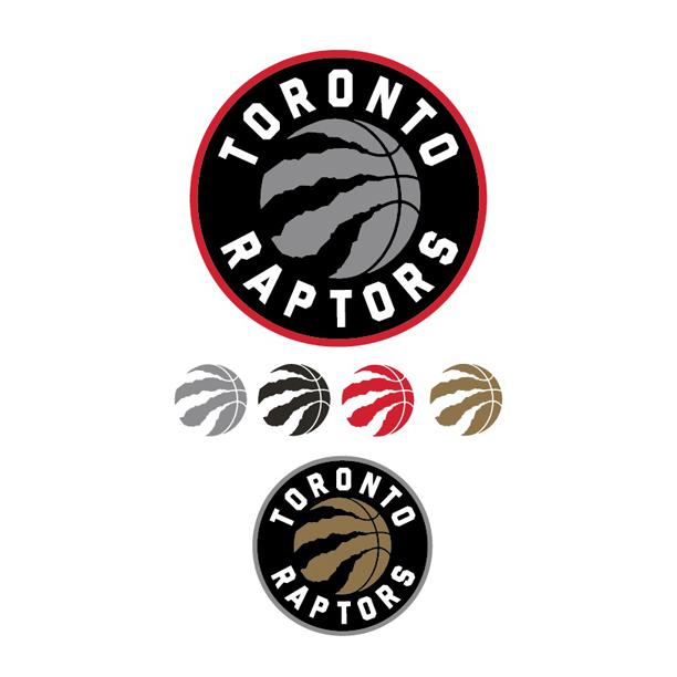
                I would be shocked if the ringed logos were used for anything besides getting the full colour scheme in there, I bet the alt logo will just be the ball/claw. Red ring is main and grey ring is alt for jerseys?

                For anyone who thinks they messed up the release take a step back and think about it. Fuck Brooklyn is huge, they make a point of imitating them after quite the game. Look at how much attention that got that quickly. Shock value was huge. This was planned, right from the get go. They release a quick logo and delete it? Reporters let it out thinking they have a scoop. People start paying attention. People start paying attention they make another F Brooklyn statement...

                I like the colours, I like the attention, I like the look. Mostly I like winning.

                I'm excited for January
                Last edited by Bandit; Fri Dec 19, 2014, 06:35 PM.

                Comment


                • Bandit wrote: View Post
                  The Basketball with the claw mark is awesome.

                  The colour scheme can be great, really have to see it on some jerseys (new court? Wasn't there some rumour about Drake buying a court?) to see how they handle proportions. Could be a great minimalist look with some nice highlights using those colours.

                  I would be shocked if the ringed logos were used for anything besides getting the full colour scheme in there, I bet the alt logo will just be the ball/claw. Red ring is main and grey ring is alt for jerseys?

                  For anyone who thinks they messed up the release take a step back and think about it. Fuck Brooklyn is huge, they make a point of imitating them after quite the game. Look at how much attention that got that quickly. Shock value was huge. This was planned, right from the get go. They release a quick logo and delete it? Reporters let it out thinking they have a scoop. People start paying attention. People start paying attention they make another F Brooklyn statement...

                  I like the colours, I like the attention, I like the look. Mostly I like winning.

                  I'm excited for January
                  Did it exactly what it should have. Great job by them. The whole package is going to look great

                  Comment


                  • More thoughts.
                    - Don't mind the newer versions posted as much.
                    - They look much less like Nets knockoffs on a white background
                    - I still think the outer circle is pointless and especially so in red.
                    - It seems obvious that the grey is supposed to be a silver and that it and the gold will have some kind of metallic sheen. There's no other way grey on black makes sense. Not sure how I feel silver and gold.
                    - Glad to see they intend the ball logo to sometimes be a standalone icon. I actually don't mind the ball icon all by itself -- it will look good on a hat.
                    - The way that bottom claw mark traces the stitching looks weird -- too curvy.
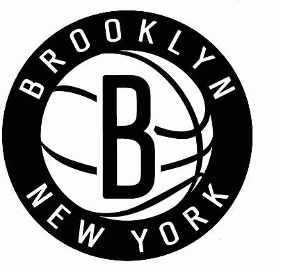
                    - I hope they're not planning to make the primary jerseys black -- this logo on a black jersey not only looks like a Nets ripoff, it *is* a Nets ripoff.
                    @EdTubb - edwardtubb at gmail

                    Comment


                    • O well. Im just glad they didn't fuck up as far as to be called the Pelicans.

                      Comment


                      • TeamEd wrote: View Post
                        More thoughts.
                        - Don't mind the newer versions posted as much.
                        - They look much less like Nets knockoffs on a white background
                        - I still think the outer circle is pointless and especially so in red.
                        - It seems obvious that the grey is supposed to be a silver and that it and the gold will have some kind of metallic sheen. There's no other way grey on black makes sense. Not sure how I feel silver and gold.
                        - Glad to see they intend the ball logo to sometimes be a standalone icon. I actually don't mind the ball icon all by itself -- it will look good on a hat.
                        - The way that bottom claw mark traces the stitching looks weird -- too curvy.
                        - I hope they're not planning to make the primary jerseys black -- this logo on a black jersey not only looks like a Nets ripoff, it *is* a Nets ripoff.
                        Bold 1 - Like I posted above, I would bet the ring serves 2 purposes and neither is for the actual logo. 1) Mock the nets 2) Display the Jersey schemes

                        Bold 2 - I'm thinking the base is going to be a grey, highlighted by black with a gold trim

                        Comment


                        • Even the FONT is the same. Who is the idiot who made this abomination


                          EDIT: this idea reminds me of this FedEx commercial.

                          Last edited by godkingleonidas; Fri Dec 19, 2014, 07:03 PM.

                          Comment


                          • Well. You might be right. But, the thing about the outer circle is that it tells you the black background behind the text is an integral part of the logo. I don't think a black circle is the best look for this design.
                            It's prefer no circle and the colour behind the text to be whatever the base colour of the jersey ends up being.
                            @EdTubb - edwardtubb at gmail

                            Comment


                            • Black is the new orange.

                              Comment


                              • Somewhere Nets fans are trolling & cackling hysterically.

                                Comment

                                Working...
                                X