Announcement
Collapse
No announcement yet.
Raptors Rebrand Theory
Collapse
X
-
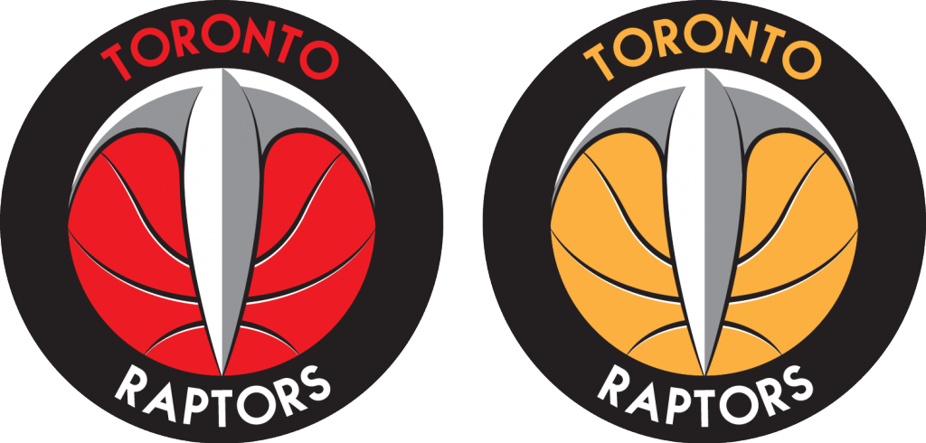
I like the concept, but the design seems slightly off to me. I'm not trying to be rude or vulgar, but the first thing that came to mind when I looked at the red design was a scrotum. I feel awful writing that, but I'm just telling you like it is. I would imagine that some tweaking to the claw might help, or maybe adjusting the lined in the basketball. They look a little like veins right now, which is likely leading to my problem.Balls of Steel wrote: View Post
I will likely reread this comment and delete it in five minutes. We shall see..
Comment
-
Thanks for your comments. I know I'm putting myself out there. Thanks for your honesty. Just really disappointed in the design that they came up with.Garbo wrote: View PostI like the concept, but the design seems slightly off to me. I'm not trying to be rude or vulgar, but the first thing that came to mind when I looked at the red design was a scrotum. I feel awful writing that, but I'm just telling you like it is. I would imagine that some tweaking to the claw might help, or maybe adjusting the lined in the basketball. They look a little like veins right now, which is likely leading to my problem.
I will likely reread this comment and delete it in five minutes. We shall see..“The saving of our world from pending doom will come, not through the complacent adjustment of the conforming majority, but through the creative maladjustment of a nonconforming minority.” - Martin Luther King
Comment
-
Are the veins in your balls that pronounced? You might want to get the funberries checked out.Garbo wrote: View PostI like the concept, but the design seems slightly off to me. I'm not trying to be rude or vulgar, but the first thing that came to mind when I looked at the red design was a scrotum. I feel awful writing that, but I'm just telling you like it is. I would imagine that some tweaking to the claw might help, or maybe adjusting the lined in the basketball. They look a little like veins right now, which is likely leading to my problem.
I will likely reread this comment and delete it in five minutes. We shall see..
Comment
-
-
A raptor is a cartoon character? I think you need to open an encyclopediaJclaw wrote: View PostLost in all of this......I guess we're still going to named after an animated character from a nineties' kids movie. Oh well. Nice hat. Go Raptors.9 time first team all-RR, First Ballot Hall of Forum
Comment
-
anyone think they didn't really mean to release it today? that twitter post may actually have been an accident. it's usually a young intern in charge of social media - wouldn't be impossible
on the other hand, I think the "OMG its a basketball in a circle, therefore it looks like the Nets" is a little overblown.
 Last edited by stooley; Sat Dec 20, 2014, 08:07 AM."Bruno?
Heh, if he is in the D-league still in a few years I will be surprised.
He's terrible."
-Superjudge, 7/23
Hope you're wrong.
Comment
-
-
Pretty much every logo has a ball in it but it's being compared to the Nets logo because of the placement of the words "Toronto" and "Raptors".stooley wrote: View Postanyone think they didn't really mean to release it today? that twitter post may actually have been an accident. it's usually a young intern in charge of social media - wouldn't be impossible
on the other hand, I think the "OMG its a basketball in a circle, therefore it looks like the Nets" is a little overblown.
 You come at the King, you best not miss.
Comment
-
Huh, fair enoughMr.Z wrote: View PostPretty much every logo has a ball in it but it's being compared to the Nets logo because of the placement of the words "Toronto" and "Raptors"."Bruno?
Heh, if he is in the D-league still in a few years I will be surprised.
He's terrible."
-Superjudge, 7/23
Hope you're wrong.
Comment


Comment