I don't see how its "way better than ours"...every logo looks the same now, and after everyone spent weeks ripping the Raps for looking like Brooklyn, we soon realized that it was a league mandate to use that design
9 time first team all-RR, First Ballot Hall of Forum
I don't see how its "way better than ours"...every logo looks the same now, and after everyone spent weeks ripping the Raps for looking like Brooklyn, we soon realized that it was a league mandate to use that design
The first one incorporates an actual Hawk(face), which I think looks much better than ours. What's the point of being called the Raptors when there's no reference to the actual dinosaur itself? As cheesy and outdated as our original logo is/was, at least there's a fucking Raptor involved. Pretty sure it wouldn't be too hard for these marketing geniuses to draw up a menacing looking Raptor. Then again, I may be wrong, because they didn't include it anywhere in the new shit.
Their second logo is a bit silly, imo, with a Hawk rising from the ashes and flames? That's supposed to be a Phoenix...
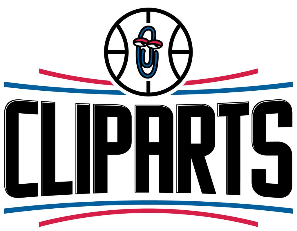
Hehe. None of you have posted up the worst of the new logos yet:
I mean, black? The hideous wordmark? The logo, which in fact is WORSE THAN THE LAKER RIPOFF THEY WERE USING?
Axel wrote:
Now Cody can stop posting about this guy and we have a poster to blame if anything goes wrong!!
KeonClark wrote:
We won't hear back from him. He dissapears into thin air and reappears when you least expect it. Ten is an enigma. Ten is a legend. Ten for the motherfucking win.
KeonClark wrote:
I can't wait until the playoffs start.
Until then, opinions are like assholes. Everyone has one and they most often stink
Fitting that the clippers logo looks like it was designed with Microsoft Paint and Clip-art.
Axel wrote:
Now Cody can stop posting about this guy and we have a poster to blame if anything goes wrong!!
KeonClark wrote:
We won't hear back from him. He dissapears into thin air and reappears when you least expect it. Ten is an enigma. Ten is a legend. Ten for the motherfucking win.
KeonClark wrote:
I can't wait until the playoffs start.
Until then, opinions are like assholes. Everyone has one and they most often stink
Nope... logo is legit. Look at the Draft Caps.... it's being used there.
Axel wrote:
Now Cody can stop posting about this guy and we have a poster to blame if anything goes wrong!!
KeonClark wrote:
We won't hear back from him. He dissapears into thin air and reappears when you least expect it. Ten is an enigma. Ten is a legend. Ten for the motherfucking win.
KeonClark wrote:
I can't wait until the playoffs start.
Until then, opinions are like assholes. Everyone has one and they most often stink
I don't mind them ... I mean at this point I just accept that all logos have the rondelle around the actual logo. I actually like how Atlanta went with "Atlanta Hawks Basketball Club" around it ... very Euro-Football.
But ya, whats up with the 'Phoenix' fire thing? Seems weird.
I don't mind them ... I mean at this point I just accept that all logos have the rondelle around the actual logo. I actually like how Atlanta went with "Atlanta Hawks Basketball Club" around it ... very Euro-Football.
But ya, whats up with the 'Phoenix' fire thing? Seems weird.
They must be reading these forums... they chinced my Mack North Basketball Club moniker! MNBC 4 LIFE!
The first one incorporates an actual Hawk(face), which I think looks much better than ours. What's the point of being called the Raptors when there's no reference to the actual dinosaur itself? As cheesy and outdated as our original logo is/was, at least there's a fucking Raptor involved. Pretty sure it wouldn't be too hard for these marketing geniuses to draw up a menacing looking Raptor. Then again, I may be wrong, because they didn't include it anywhere in the new shit.
Their second logo is a bit silly, imo, with a Hawk rising from the ashes and flames? That's supposed to be a Phoenix...
no reference??? uhh the 3 claw marks?
although i would have taken this as the official logo:
although i would have taken this as the official logo:
Claw marks don't necessarily indicate a dinosaur. How the hell would anyone just looking at the Raptors logo figure that it's a Raptor? My guess is not many, if any at all. I was referring to a dinosaur head, something like you just posted.
 Tweet
Tweet


Comment