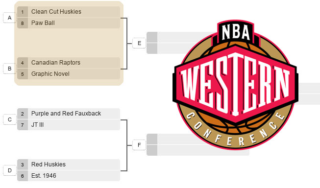
Let the playoffs begin. This is how it’s going to work:
For the first round we’ll have two matchups a day, voting for those matchups will remain open for 24 hours – 9AM to 9AM the following day, at which point the voting will be closed and the new matchup will appear on the site. So the schedule for the week is like this:
- Tuesday (West): Clean Cut Huskies vs Paw Ball, Canadian Raptors vs Graphic Novel
- Wednesday (East): Sleek vs Glow, Operation Skeleton vs JT II
- Thursday (West): Purple and Red Fauxback vs JT III, Red Huskies vs Est. 1946
- Friday (East): Fierce vs JT I, Old Renewed vs Boost
Here’s the kicker: All voting will re-open on Saturday 9AM to Sunday 9AM. The first round results will be officially announced on Sunday afternoon, and that’s when the second round schedule will be released.
—
On to the voting, where we’re focused on the 1/8 and 4/5 matchups in the West.
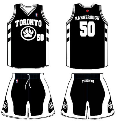
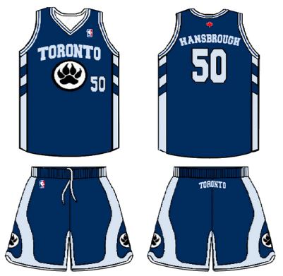
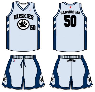
West: Clean Cut Huskies (1) vs Paw Ball (8)
Clean Cut Huskies
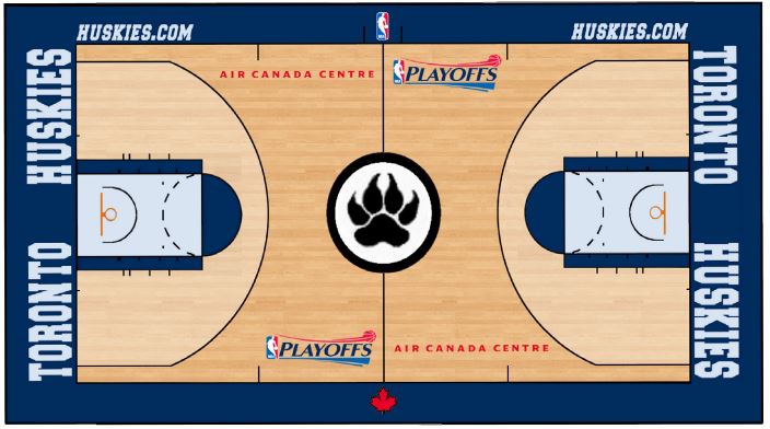
Toronto Huskies – Back to the original name and uniting our major pro sports teams with blue.

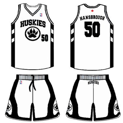
Paw Ball
The Paw ball was made with a unique colour-scheme of light and dark blue in attempt to bring something new to the league and yet still be stylish. I also added a black and white version that I thought would also be cool at least as an alternative jersey. It has an NBA-ready look (not like Terrence Ross though) and yet is totally different from the designs of any other team. This jersey is a bit plain but that’s what I find it’s beauty in.
Hidden feature: the teeth on the sides of the shorts. Check out more here – PDF.
Vote: Clean Cut Huskies vs Paw Ball
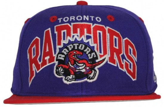
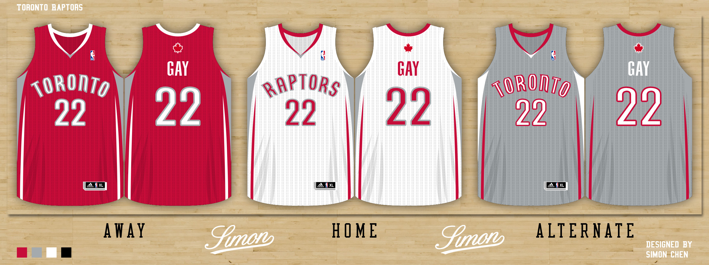
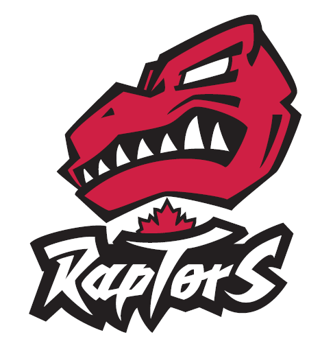
Canadian Raptors (4) vs Graphic Novel (5)
Canadian Raptors
A “Canadian” look.
Graphic Novel
We’ve redrawn the Raptors vintage text from the ground up and made subtle changes to the shapes of the lettering.
I know Tim Leiweke wanted to have a Canadian element to the brand so we’ve also included a maple leaf between the text and head.
The head inspiration was drawn from graphic novels to give it a very gritty look with the white eyes and under-bite. We also wanted to have the head more like a real Raptor head which is longer than the current design (more T-Rex shaped).
Vote: Canadian Raptors vs Graphic Novel