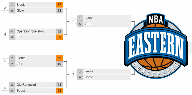
Sleek (1) vs JT II (5)
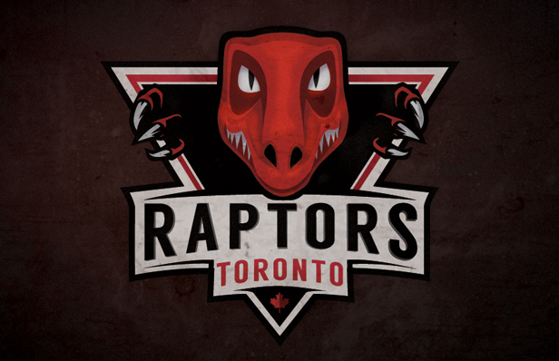
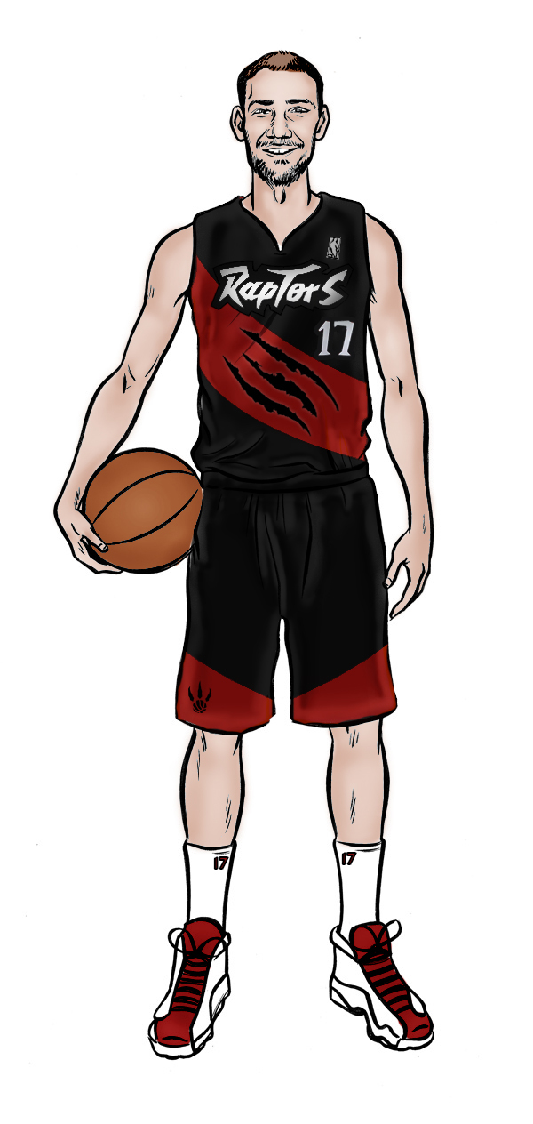
Sleek
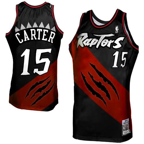
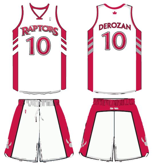
The logo I designed is flawed, but it was my inspiration moving forwards. I thought it would be nice to bring back the old Raptors text (for nostalgic purposes more than anything, and to commemorate our 20th year). I have also submitted a more subtle, minimalist design that I think fits in nicely with what the rest of the league are doing.

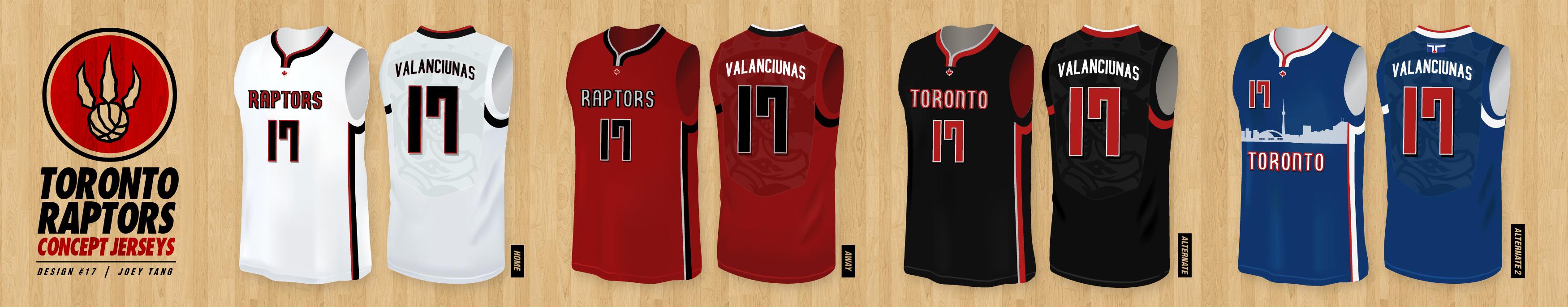
JT II
Vote: Sleek vs JT II
Fierce (2) vs Boost (6)
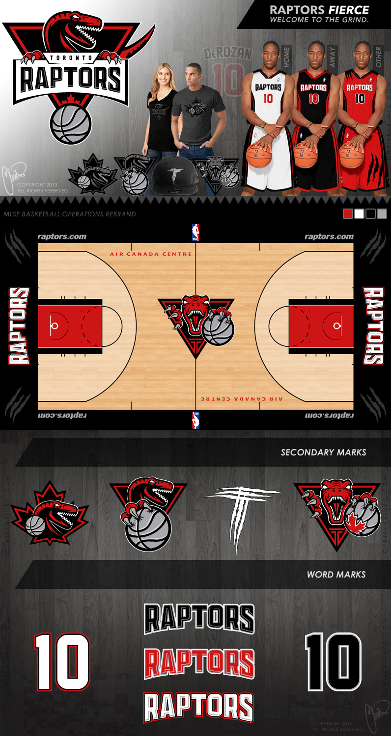
Fierce
Canada’s NBA team requires a more fierce and professional identity to ignite a fan-base with renewed optimism for the future.
Boost
Raptors is an already well-established brand. It just needs small modifications in the logo and image to give it a boost/upgrade that it needs to make it a winner’s team! So, my focus was to make it SERIOUS and FEARSOME-POWERFUL. Take the Raptor’s funny looking body away, make the pupil disappear, sharper and much more dazzling font used, highlights and shadows to make a serious remark. View the full suite of logos here (PDF).
Vote: Fierce vs Boost