They actually look pretty sweet.
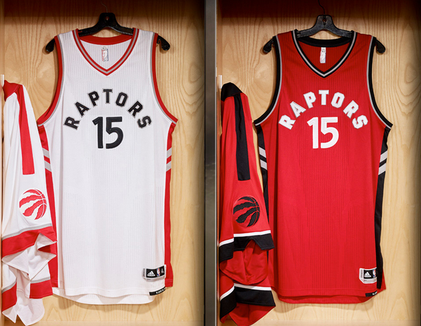
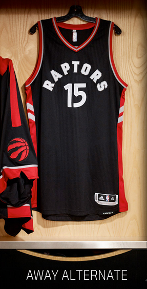
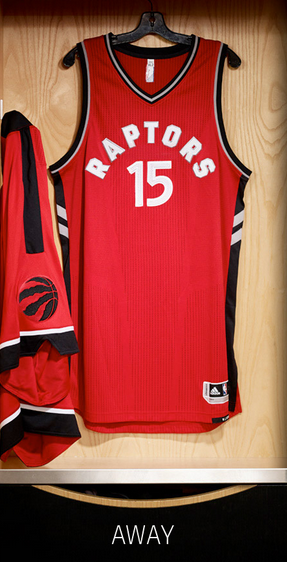
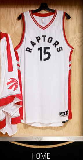
The Raptors unveiled their new uniforms for the 2015-16 season on Monday night. Four new designs were published on Raptors.com, after Drake donned an OVO-inspired no. 6 jersey (shoutout to Cory Joseph) while kicking dirt on what little remains of Meek Mill’s career.
***
***
***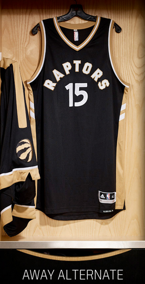
Personally, I like everything about the jerseys apart from the weird block lettering. It’s the same font as the “WE THE NORTH” logos but it looks squished on the uniforms. Otherwise, the designs are well-done. These new kits will fly off the shelves.
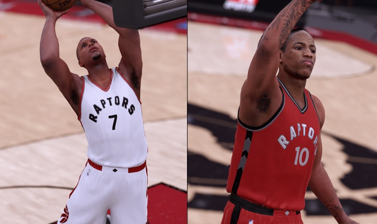
As of right now, there aren’t any pictures of players modeling the uniform. But fret not, NBA2K16 came through with a mock-up.
More from the press release:
Jersey:
- The chevrons on the side of the jersey will now point “north” to align with our slogan of “We
The North.” The chevrons had pointed downward since being introduced as a uniform
accent in 1999. - The fonts are accented with silver lining, a throwback to our past.
- Player names on the back will now be arched rather than straight across.
- At the waist-level hem of the jersey is an upside-down tag with our “We The North” slogan.
It will be visible to players when they tuck in their jersey, and will serve to remind them of
what they represent. - Engineered mesh finish with a subtle design to emphasize a more aerodynamic feel that
follows the contours of the body.
Shorts:
- The front of the waistband dons a Maple Leaf, incorporating our new look and feel with the
symbol of our nation. - The shorts have a shout-out to Toronto, sometimes referred to as the “T Dot.” “T.O.” is
stitched on the side with our new logo representing the “O.”
Back to recovering from Brosheaga.

