
This was a game the Raptors had better won otherwise heads might have rolled. Nobody gets too upset if you lose to Indiana on the road, but you lose to the Jazz at home and it would have been nothing short of a crisis. See, that’s because the Jazz are really bad. When you think of TankNation, Philadelphia might come to mind but the Jazz have supplanted the Sixers from that honor with a now fully-deserved 0-7 record with the last five losses being suffered by 11, 16, 10, 24, and 24 points.
The individual game calls may not be bang on in the pre-season predictions, but we’re on track at 3-4. There’s little to be said about this game in terms of individual performances and I think Andrew’s reaction covered all that needed to be covered.
Instead, I’d like to talk about one of my favorite apps (or what used to be and hopefully becomes again) which is the TheScore app. When I read my box scores I like to know some key facts about players:
- How much they scored
- What they shot (FGs)
- How many FTs they took
If you show #1 on its own, it’s rather pointless. If you show only #2 and #3, then you have to do math to figure out how much they scored. It’s like love and marriage, you can’t have one without the other.
Now, the Score app used to show the entire line for a player in one view before, but when they “modernized” their app, they figured they’d get a little fancy. Here’s how a box score reads on the app right now:
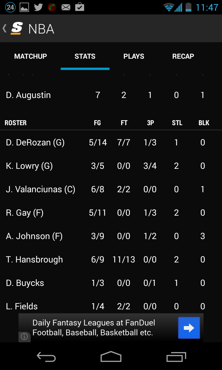
This is no good because it does not show me how DeRozan got his 18 points. It’s that simple. If he got them on 8/12 shooting and hit 4 FTs along the way, great. If he got them on 4/18 shooting, then it’s not so good. The bottom line is that information that is important is being hidden in favor of low-importance information such as turnovers which don’t deviate as much as points (i.e., their standard deviation is low). The NBA fans mind associates PTS with FG heavily and perceives this view as having low value.
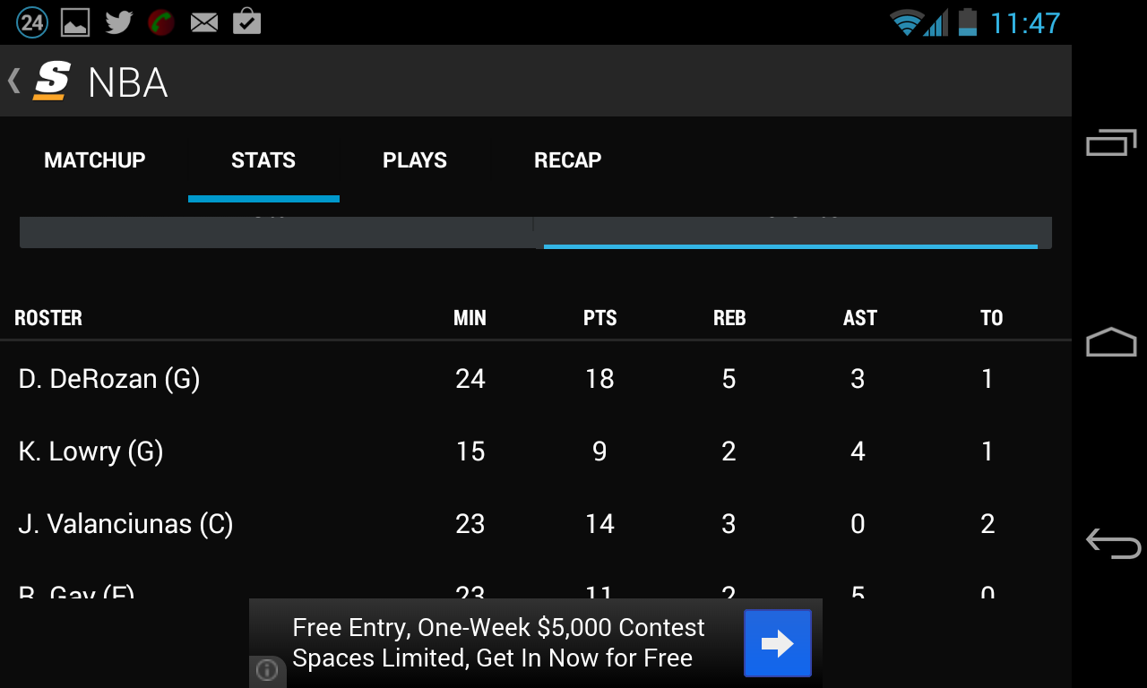
The FG information is presented, but it comes at the expense of scrolling down where another table is presented with the player names being repeated.
Ahah! There it is, but now I can’t see the points. For shame. You can’t expect a lazy user like me to remember what DeRozan scored, scroll down and then check his FG/FTs, this is the internet and we have short attention spans. In the process of executing that annoying scroll I forgot everything about DeRozan’s line and have to start anew. By the time the rest of the columns like FG become visible during the scroll, I now have to scan the left column to find DeRozan’s name again to realign. Too much work to make up for lost context. This, folks, is poor user experience and coming from an app that has been the gold standard of sports scores, this travesty needs to be rectified immediately.
Simply reducing the font size or compressing the columns together would leave more than enough space for all the line info to show in one space. It might not look so roomy, but it’s denser, more valuable, information delivered faster.
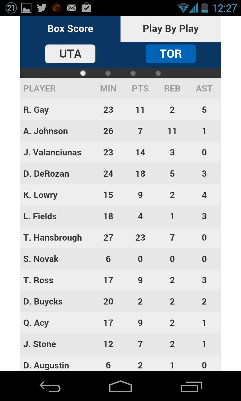
I had hoped that switching to landscape mode on the phone might expand the columns, but alas, it only exacerbates the space wastage – just look at the space being regretfully withered away between the end of the player name and the first stat:
So I ask The Score that they please fix this ASAP. At the very least, adopt the NBA.com mobile site approach where partial information is shown (e.g., PTS), but on a swipe to the right, the rest of the info is dutifully displayed. At least there’s no scrolling required, the player name does not shift, and the mind doesn’t have to realign with the scrolling – basically, your eyeballs can stay fixed and you don’t lose context.
Initial view:
View on swipe to right:

Guys, this is urgent business. Let’s get to it.