
“It ain’t what they call you, it’s what you answer to”
– W.C. Fields
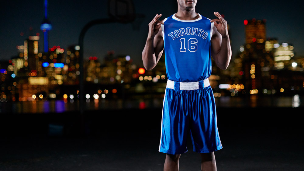
After the Raptors Huskies held off the Knicks Saturday night in front of a raucous home crowd an ill-advised sentiment started to bubble to the surface thanks to some clever marketing from the folks at MLSE. For one night, the ACC turned back the clock and morphed into the ghost of the Maple Leaf Gardens, where the Toronto Huskies played one season in the BAA. You’d be hard-pressed to find fans who weren’t impressed with the aesthetic. The court design leaned on Huskies heritage, with beautiful blue paint and white lines to detail an old hardwood floor. The tone was synonymous with the Leafs, Jays, and Argos, and for many it united the Raptors with their “6ix brethren”.
That feeling was doubled when the team took the court. Jogging out in their royal blues with white faux-belts to “hold” up their shorts fans clamoured to get their hands on any and all merchandise they could. Thank the basketball gods I was not one of them.
While the look was impressive, the immediate overreaction to rebrand the entire team was downright offensive. Leaving the importance of tradition aside for a second, go back and put the images you saw Saturday under a microscope and chances are your feelings change. The ‘charm’ of the Huskies logo was no more than an outdated typeface resembling a suburban mom’s best crack at graffiti, and the uniforms looked like a boxer from the 90’s decided to wear his tank top into the ring. The colours of the court were admittedly nice and accurate, but does our city really need any more blue and white?
In some instances, the unity works. Take Pittsburgh for example, who’s sea of black and gold crashes over the city in the form of Penguins, Pirates, and Steelers gear. Yet those looks have been in circulation for years. They came (somewhat) naturally, and you’d be hard-pressed to find anyone with a desire to change them. The Raptors on the other hand, are unique. As William Lou pointed out, the Raptors struggled through their formative years with bright purple jerseys and a DINOSAUR DRIBBLING A BASKETBALL for a logo, how dare we strip them of that pride? Fans as a whole are so consumed with the idea of throwbacks, nostalgia, and tradition, that they’re willing to sacrifice common sense. The Huskies played ONE year in 1946-47 and finished with a 22-38 record before being disbanded. In other words, the experiment was a flop.
This city is finally experiencing winning, and excitement on a grand scale, but just because the teams share the same area code, and in some cases arena, doesn’t mean they need to share the same look. The Raptors in all their eternal “wtf are they named after a dinosaur for anyways?” glory are unique, as are their fans. The purple is sorely missed, and already enough nostalgia to tug at fans’ heartstrings (and their wallets). The Huskies were fun for a night, but please, don’t let the dogs out.