Big thank you to all the participants! Lots of people put in a lots of effort for this so let’s give them a round of applause:

Please check out all the entries, note that you can view the larger version of any image by clicking on it. Make sure to vote in the poll at the bottom of this post (click here to get to it). We will identify the top 16 entries that way and then hold a head-to-head which will be the “playoffs”. The winner gets a DeMar DeRozan jersey courtesty of Brian Gerstein (brian.gerstein@century21.ca) and two tickets to a game, so please make sure to vote. We’ll close the poll (i.e., the regular season) soon…
Note that we’eve tried to keep all participants anonymous to prevent any bias based on whatever (email zarars@raptorsrepublic.com if you want to change that for your entry). Happy voting!
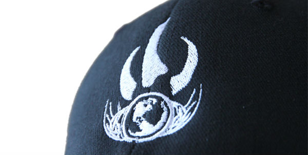
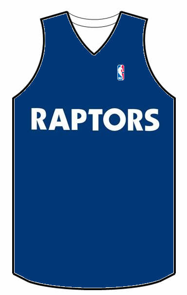
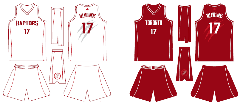
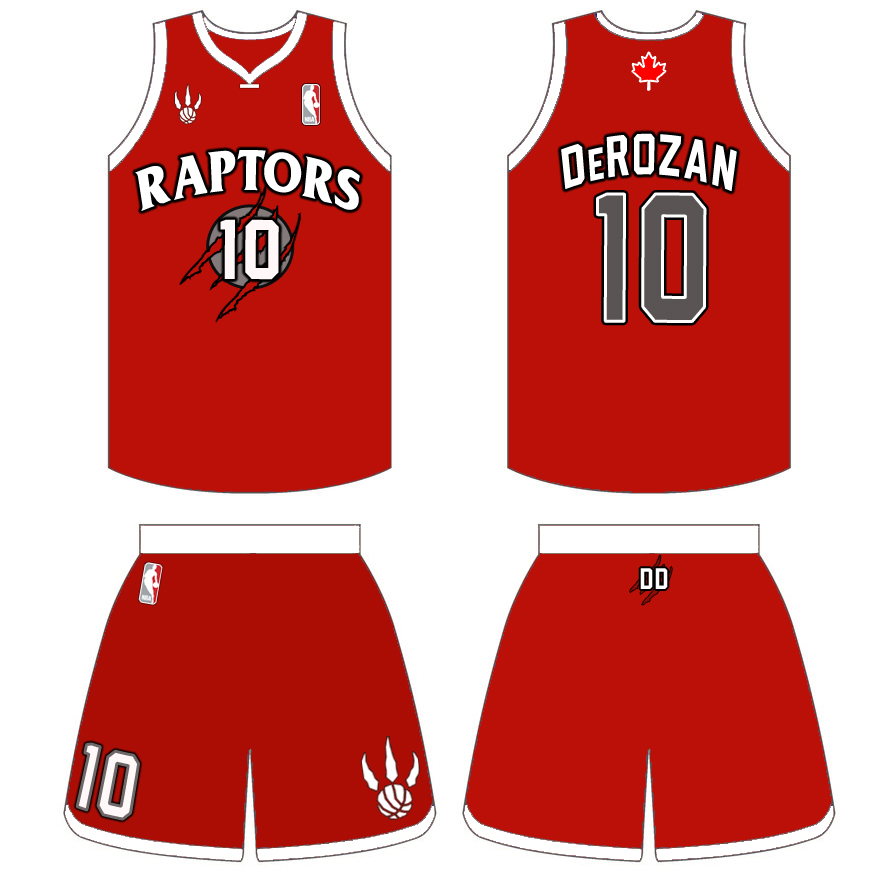
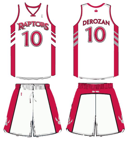
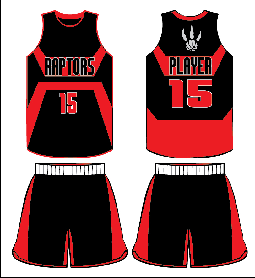
#1 – Sleek
The logo I designed is flawed, but it was my inspiration moving forwards. I thought it would be nice to bring back the old Raptors text (for nostalgic purposes more than anything, and to commemorate our 20th year). I have also submitted a more subtle, minimalist design that I think fits in nicely with what the rest of the league are doing.

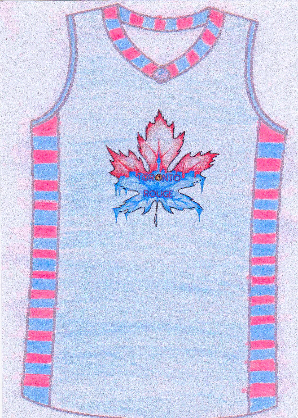
#2 – Toronto Rouge
A modern, French Canadian inspired logo with geographical references specific to the Toronto area. Rouge stands for red, which is the aura coming off the lakefront. Toronto is an international city and this name gives it an International feel. Could result in a pretty intimidating chant. Check out TorontoRouge.com
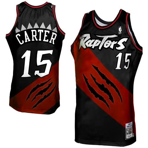
#3 – Glow
This jersey I made is for road games. I put Canadian leafs on the pants for a Canadian theme! GO Raptors!

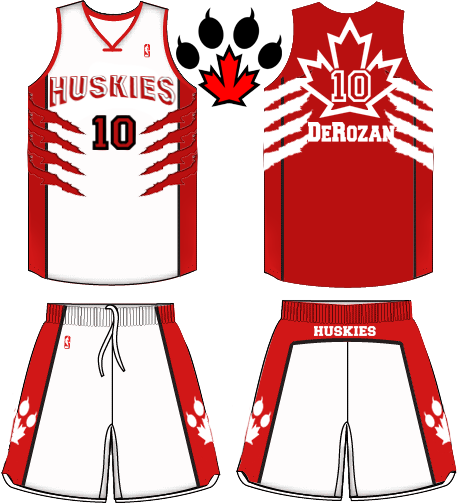
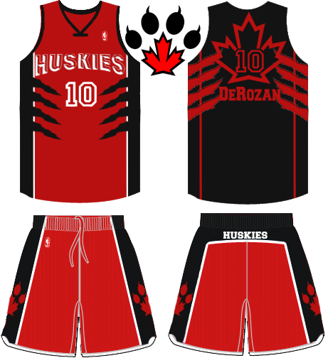
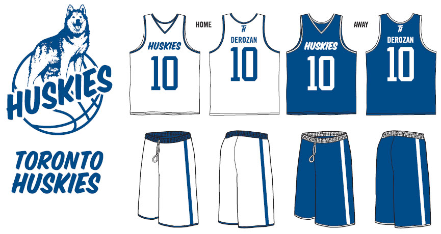
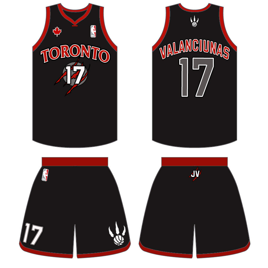
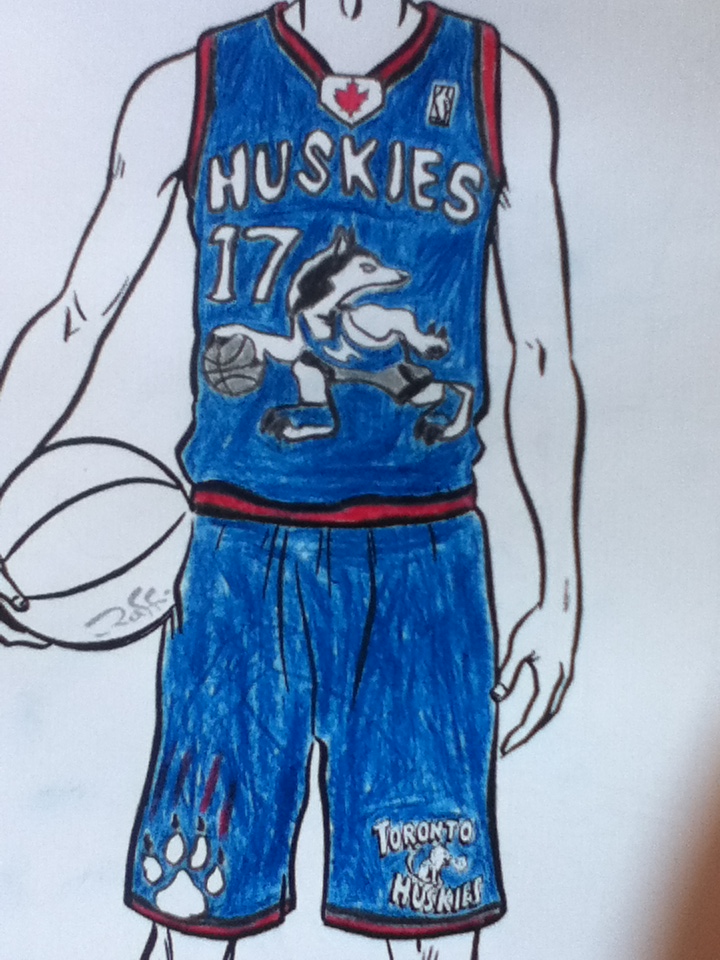
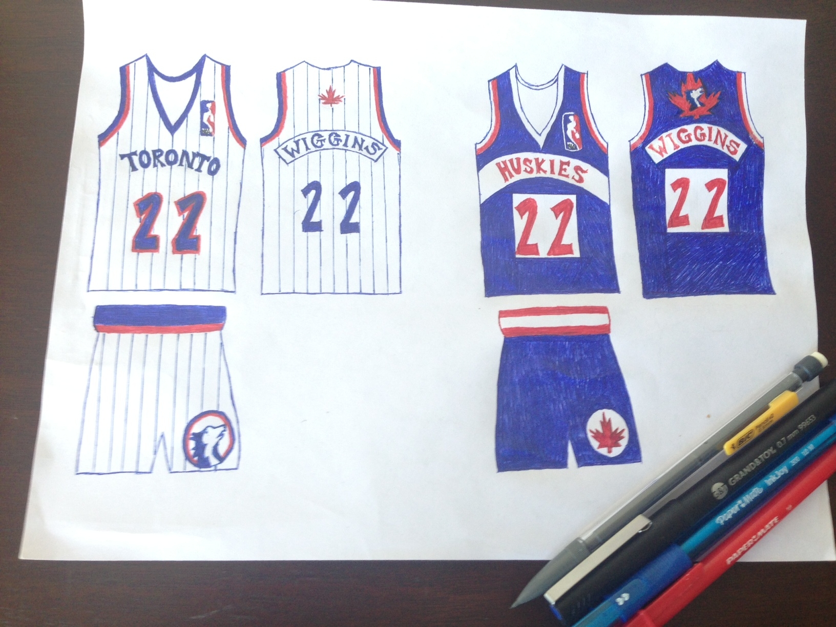
#4 – Red Huskies
Huskies Logo: I feel we’re in a new era with the Raptors, and a complete change would symbolize we’re not bottom of the barrel team anymore, and we’re not extinct(Pun intended). I didn’t want to copy the T-Wolves logo seeing as they’re in the same species, I think a simple yet bold logo will catch the eyes of casual and hardcore fans every where.
Jerseys: A lot of teams (if not all) have a really SIMPLE jersey design, being Canada’s only team I think we NEED to stand out! The claw marks along with the different coloured back (like the ’00 jersey) adds sort of a retro look to the jersey. I think the giant maple leaf speaks for itself.
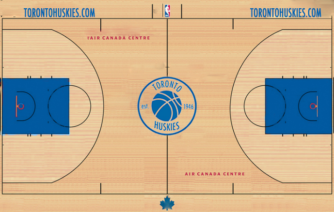
Side note: The paw print(with the maple leaf) in the middle of both pictures of the jerseys, I think would be awesome as a centerpiece of the Huskies court. These designs can be tweaked if needed later on
#5 – Leafs Blue
Kept the name Raptors but used the Leafs logo and font, probably wouldn’t be allowed by the NHL, but i think it looks great and sort of makes sense from a MLSE branding perspective.

#6 – TDOT
My initial concept to rebrand the raps was not to change the team name! The Raptors are a great name, it symbolizes speed and ferocity. So in my logo I wanted to show the sharp teeth and the basketball in the mouth. This symbolizes the fierceness says that the ball belongs to the Raptor by keeping it in its mouth. The second part of the logo is obviously the silhouette of the CN Tower to represent T-Dot and its connection with the Raptors by curving it to the Raptor head. This shows that Toronto and Raptors club sort of go hand-in-hand. As for the colors, I felt that putting purple was a must because it reminds me of my most favourite Raptors jersey: the purple and black. The secondary color was to compliment the purple and make the logo pop, the orange or the light blue.

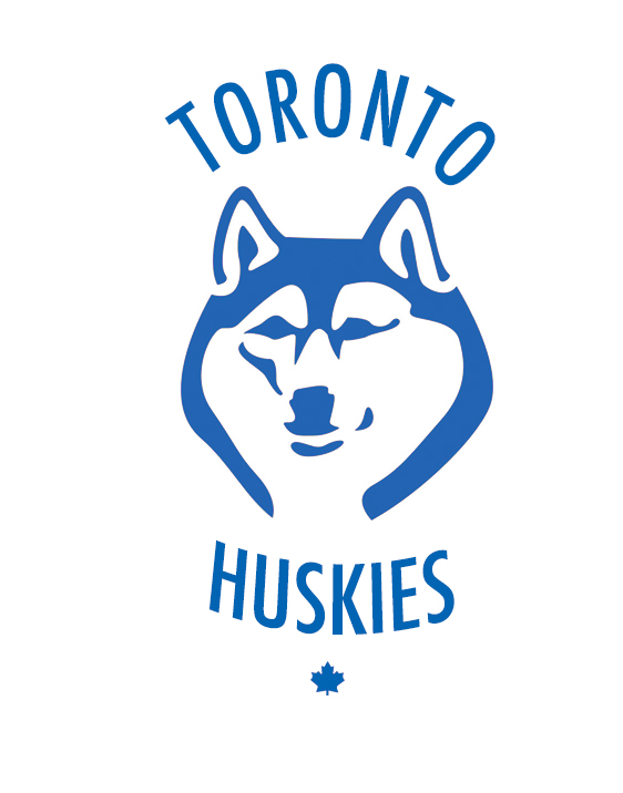
#7 – Clean Cut Huskies
Toronto Huskies – Back to the original name and uniting our major pro sports teams with blue.

#8 – Canadian Raptors
A “Canadian” look.
#9 – Purple and Red Fauxback
Returning to the purple and red fauxback style.
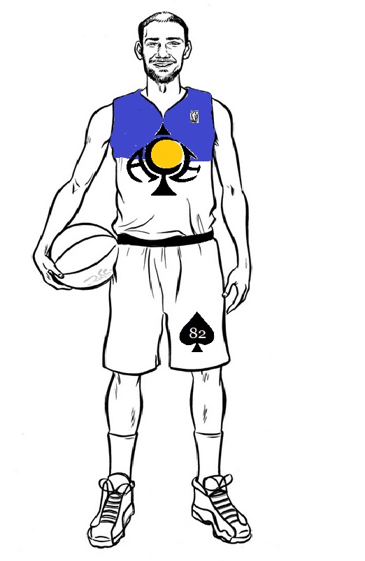
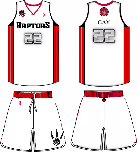
#10 – ACE
Toronto ACE Basketball, The name Ace speaks for itself it describes someone of high skill, someone who is able to accomplish things at a high rate of success. An Ace. It would give a player of this team the impression that only high-skilled, high-valued play is expected in an organization with a name that stands for the previously mentioned definition. Main colors Purple/Navy Blue, Black, Gold.. God sun in the middle of a symbol of an ACE, with the words ACE molded inside the form of an ACE. The symbol is big, it stands out showing dominance. On the away jersey all the white portions of the jersey are changed to black, and the symbol is inverted to white.
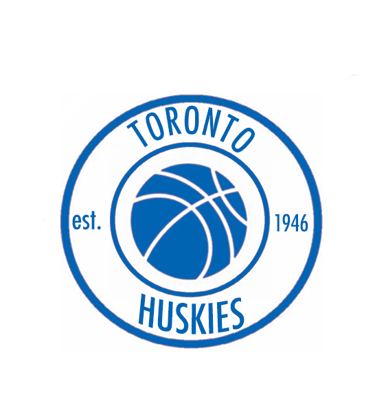
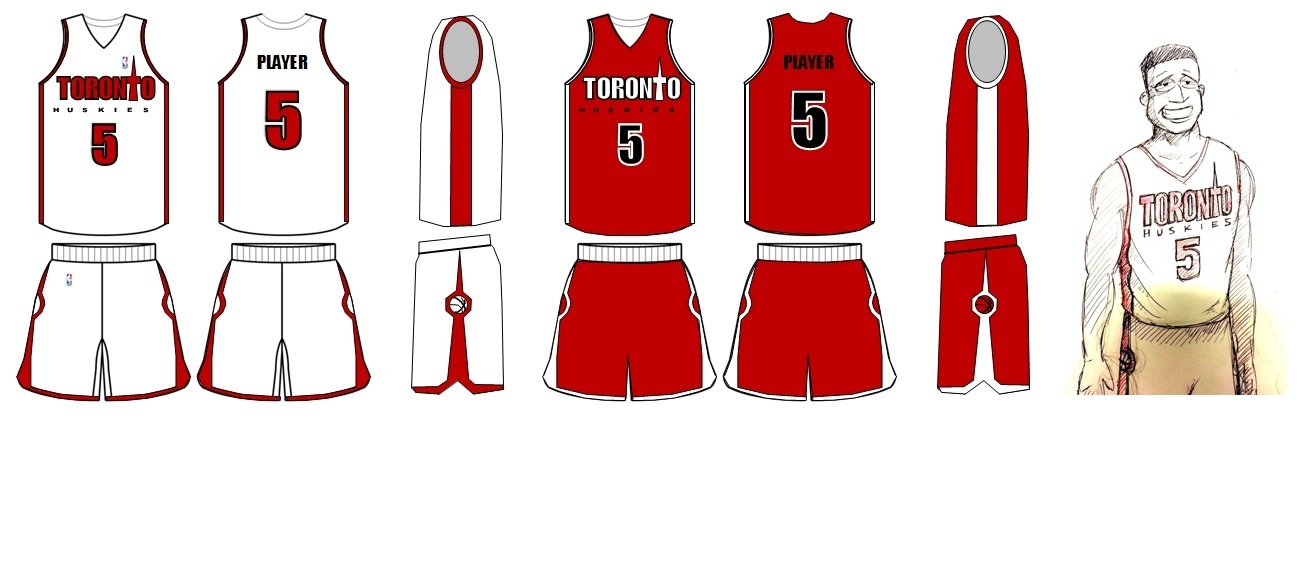
#11 – Est. 1946
I had selected both team names to work with because I appreciate and value the historical significance that the Huskies name has not only for Toronto, but for professional basketball as a whole. The Raptors selection was simply because I was born and raised in toronto and have been a die hard fan since the first time I saw a game. I’m a full time student and graphic designer with my own clothing line.
#12 – Fontize

#13 – The Leiweke
My creation is something I believe would appeal to Tim Leiweke. He wants the Raptors to become our national team so first we must change our name to something that actually exists in Canada (with a historic nod to the old Toronto team); and second we must incorporate Canada’s national colour (red). Also, I thought by aligning the colour schemes of the Raptors (now Huskies), Blue Jays and TFC, this is something that could unify the fans of Toronto (similar to Pittsburgh with the Penguins, Pirates and Steelers). Lastly, any team that incorporates pinstripes is guaranteed a playoff spot… true story. If the picture looks a little “scanned”, that’s because these were the tools I used to make them.

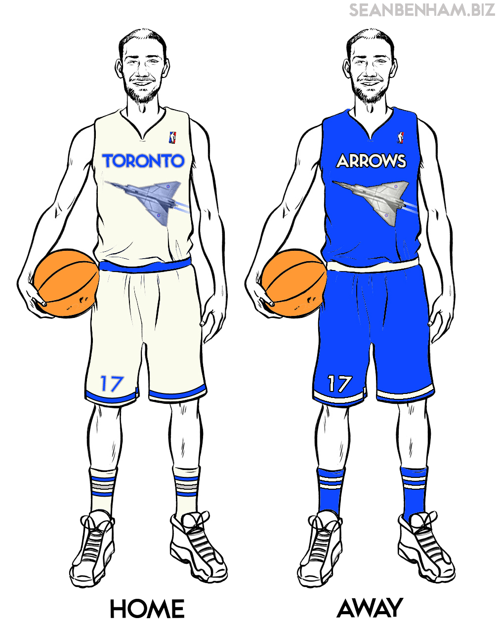
#14 – Arrows
Ideally, I’d prefer the Raptors stick with their current name. It’s corny, but it’s original and it’s ours. I’m not a huge fan of the Huskies – either as a name or a logo. The name sounds very ‘high school’ and the logo would have to be very similar to either the Minnesota Timberwolves or UCONN.
However, if they are going to make a change, I’ve attached my idea for what I’d like them to adopt. The Arrows refers to the Avro Arrow, the jet that never was. It’s a name that isn’t used by any other North American professional team, which I think is the best way to go. Also, it makes for fairly easy headline writing. (‘Arrows fly high against Celtics’, ‘Arrows miss the mark against 76ers’, etc.)
The font is the same as the TTC subway font – iconic and easily the font most recognizable as representative of Toronto. The logo is the Avro Arrow itself. While I didn’t mock up a back view, I imagine the contrails from the jet wrapping around back before fading away completely. The colour scheme is Royal Blue, Off White and Naismith Silver (gotta keep some sort of tradition going).
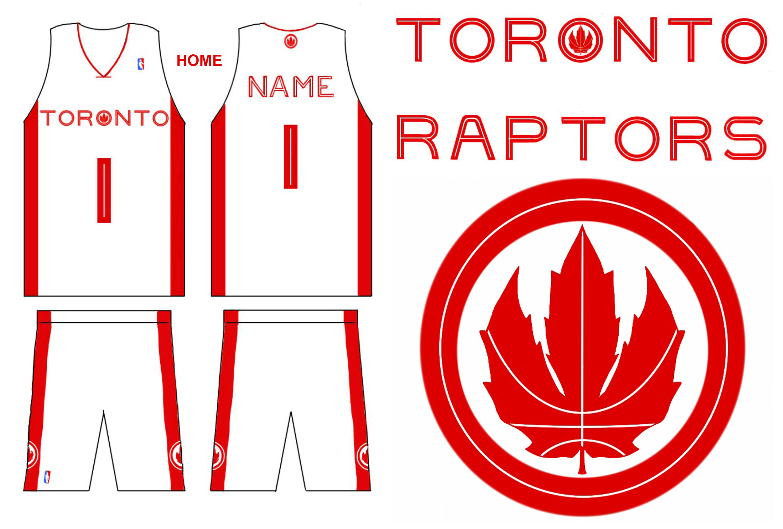
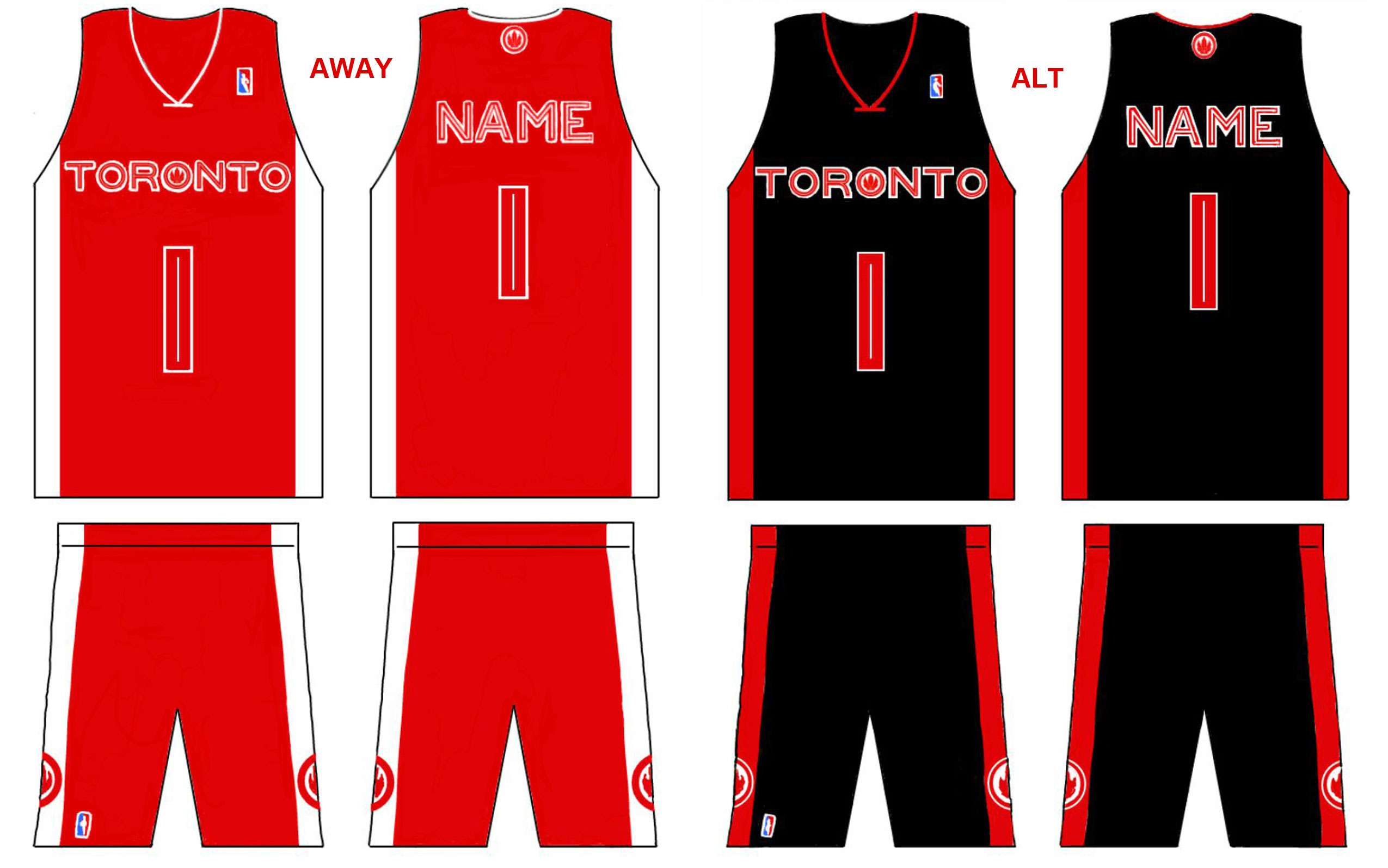
#15 – Classic Patriot
I was aiming to make the new logo and jerseys as patriotic and classic looking as possible. Here’s a quick rundown:
PATRIOTIC
– The new logo is my patriotic take on the current claw/footprint logo: notice the claw/footprint is now shaped like a maple leaf, and is surrounded by a circle (a subtle reference to the Canadian Air Force logo/roundel)
– The Raptors are Canada’s team so I went with a red & white colour scheme for the home & away jerseys (black is incorporated in the alternate uniform)
– Home jersey was meant to resemble a Canadian flag
– City name prominently displayed on the front of all jerseysCLASSIC
– Pinstriping incorporated into the font and new logo (think: the new Blue Jays uniforms)
– Went with a simple/minimalist 2 tone colour scheme (red & white) for the home & away jerseys – meant to look “timeless”, slightly “old school” – while still also paying homage to the Canadian flag
– No excessive ornamentation, gimmicks, or silver chevrons on the jersey
– Stuck with the Raptors moniker because it has become a recognizable name & brand (20th anniversary coming up, no need to change the team name!)
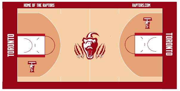
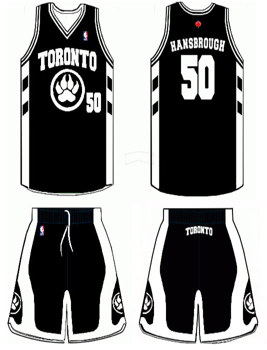
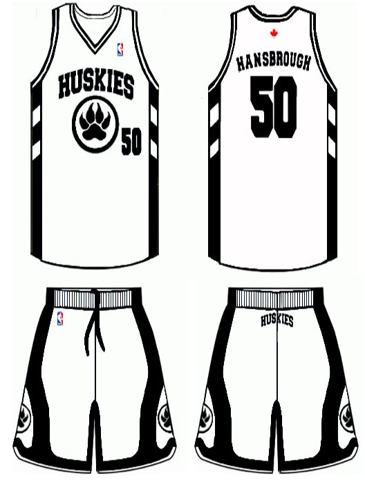
#16 – Huskies Logo
My concept basically updates the classic Huskies uniforms with a logo to bring it back to the basics while remaining timeless and clean. Toronto is a blue city. All sports teams should have blue in them. The Raptor is outdated and was created for a fad that is no longer relevant. Red is the color of Canada but Toronto doesn’t represent all of Canada, we have our own identity as should our team. Look at the best uniforms, the Bulls, Celtics, Lakers, all simple and classic, never changing. We once had a team, the Toronto Huskies. Let’s bring it back for good.
#17 – Tank

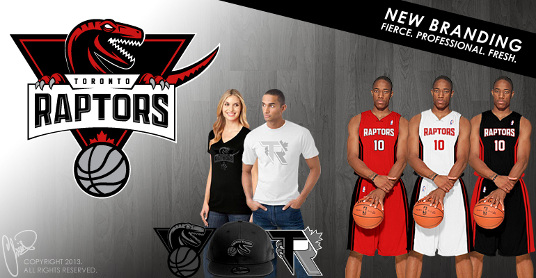
#18 – Fierce
Canada’s NBA team requires a more fierce and professional identity to ignite a fan-base with renewed optimism for the future. The full submission can be found here.

#19 – 20th Year
I put a 20 year anniversary patch because the new uniforms will be introduced for the 20th year of the raptors. I kept it basic and nice
#20 – Mosaic
This is the front of the jersey. The red represents Canada as this is Canada’s team. Purple the past and black the future. It looks cool and the colors will be airbrushed effect into the jersey and finally ‘Knights’ meaning Toronto’s night life is second to none. That’s my concept.

#21 – Operation Skeleton
This new logo puts a different spin to the Raptor brand using the concept of a skeleton and the Raptor, shaded white instead of red. This not only brings a fresh idea but a cleaner and more modern feel to the brand. The Maple Leaf on top verifies that Canadian feel as well as the claw marks solidifying the ferociousness of the Raptor. The circle around brings that classic feel as we know with many existing logo’s. Finally the logo all around is not far from the Blue Jays which has gained a lot of positive reviews after their recent brand alteration. View the full PDF submission.
#22 – Let it Flow
I don’t think the Raptors need a major re-brand but rather a tweak. That said, these “Let It Flow” jerseys are simple, elegant, and has that old school look with a fresh spin.

#23 – Paw Ball
The Paw ball was made with a unique colour-scheme of light and dark blue in attempt to bring something new to the league and yet still be stylish. I also added a black and white version that I thought would also be cool at least as an alternative jersey. It has an NBA-ready look (not like Terrence Ross though) and yet is totally different from the designs of any other team. This jersey is a bit plain but that’s what I find it’s beauty in.
Hidden feature: the teeth on the sides of the shorts. Check out more here – PDF.


#24 – Boost
Raptors is an already well-established brand. It just needs small modifications in the logo and image to give it a boost/upgrade that it needs to make it a winner’s team! So, my focus was to make it SERIOUS and FEARSOME-POWERFUL. Take the Raptor’s funny looking body away, make the pupil disappear, sharper and much more dazzling font used, highlights and shadows to make a serious remark. View the full suite of logos here (PDF).
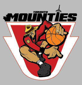
#25 – The Mounties
The theme I chose was the royal mounted police. I really wanted something Canadian and not only Toronto since this is Canada’s only basketball team. I also threw in some hints of Toronto like part of the tic Crest and the CN tower. I have also incorporated the colours and uniform of the mounted police into the design of the jersey just to tie everything in. Enjoy the design I had fun creating this!

#26 – Velocibird
rap-tor (rptr)
1. A bird of prey, such as a hawk, eagle, or owl.
2. Any of various mostly small, slender, carnivorous dinosaurs of the Cretaceous Period. Raptors had hind legs that were adapted for leaping and large, curved claws used for grasping and tearing at prey.
#27 – Suspicious Husky
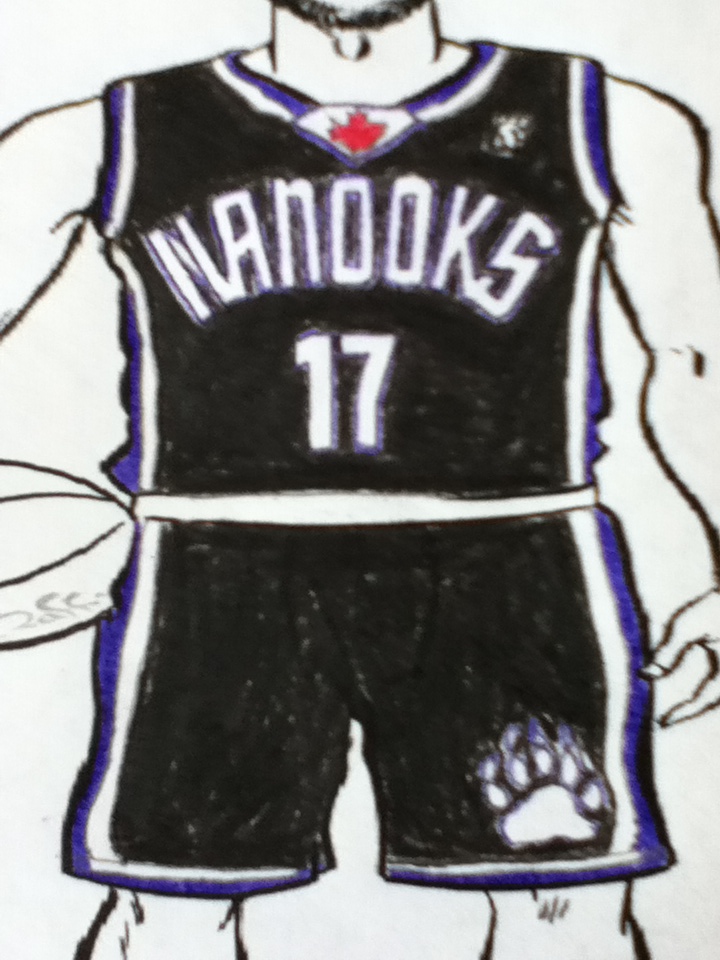
#28 – Nanooks
A Nanook stands for polar bear in the Inuit language from North Americameaning he is the master of all bears.


#29 – Clever T
Canada colours with some black lines….lots of playing on the CN tower (in the name and on the side of the shorts. Something with strong red/black/white….nothing too descript so that if “raptors” or “huskies” is chosen or changed, you don’t have to overhaul the unis much at all!!
#30 – Toronto Blizzards
The Toronto Blizzards. We’re up north and we’re ice cold assassins on the court.

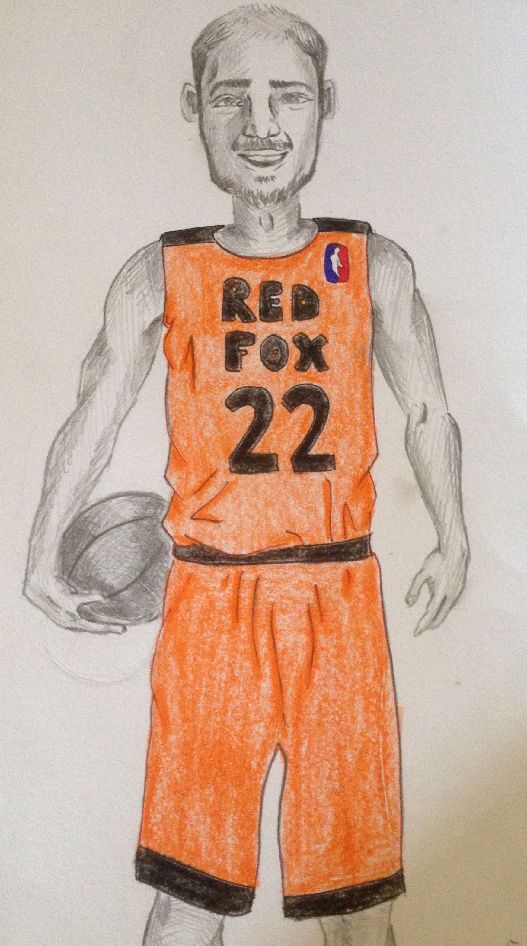
#31 – Toronto Red Foxes
The Toronto Red Fox or maybe even the “Tods”. A local animal with cunning and agility. I like the idea of the orange/black/white color scheme, similar to the Bengals, Ti-cats, and Orioles. It’s random, but it’s cool. Note the paw print logo.

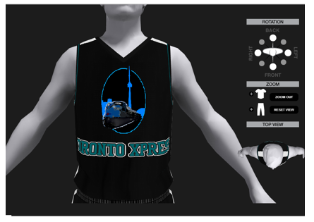
#32 – Toronto Xpress
I wanted to portray the city and bring some history to the design of a new logo. I went with the progression of the Grand Trunk Railway and the mighty roar of a diesel engine bringing fear to the eyes of the opponent as it tramples down the railway of victory!


#33 – Memorable
For my jersey design I wanted to create something simple and memorable. I chose red, white and black as jersey colors for my design. But I included one purple and white design.
#34 – Hairy Husky
#35 – Raptors Redemption
My concept for this jersey is simple… Redemption. Toronto Raptors are on the road to redefining the team, and with that redemption, this though sleek look is sharp and reflect the city of Toronto, and its vicious like the raptors emblem that’s become loved in the city.

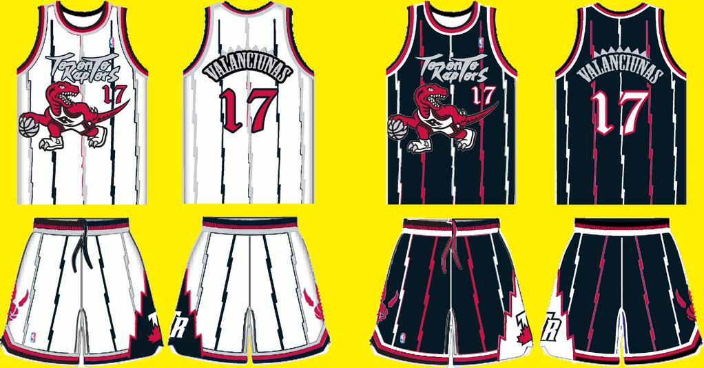
#36 – Old Renewed
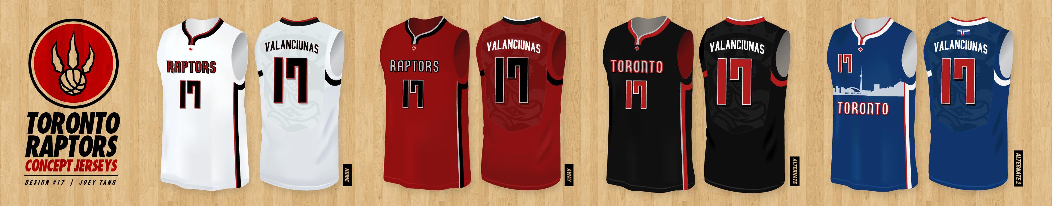
#37 – JT I

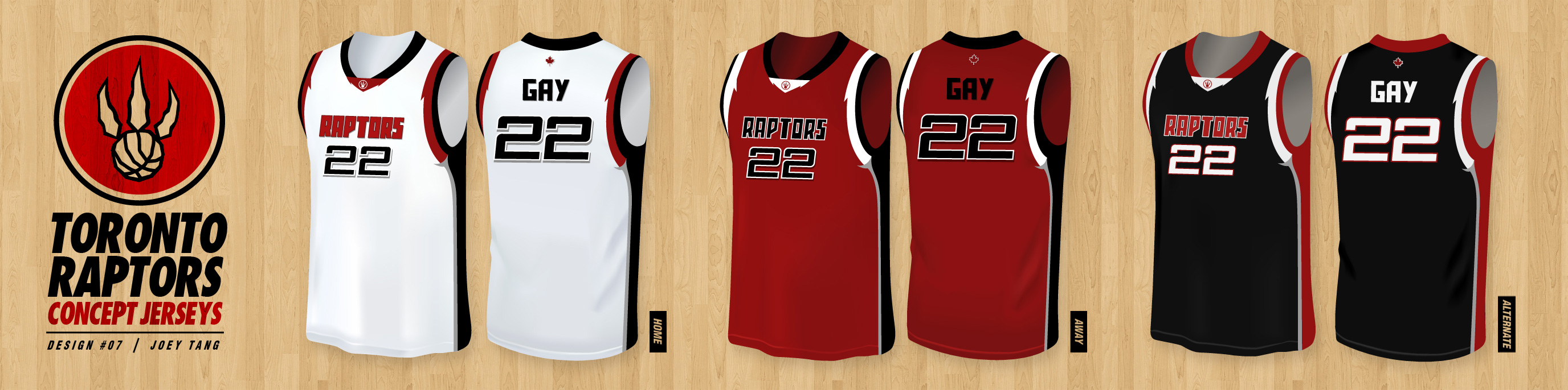
#38 – JT II
#39 – JT III

#40 – JT IV
#41 – Graphic Novel
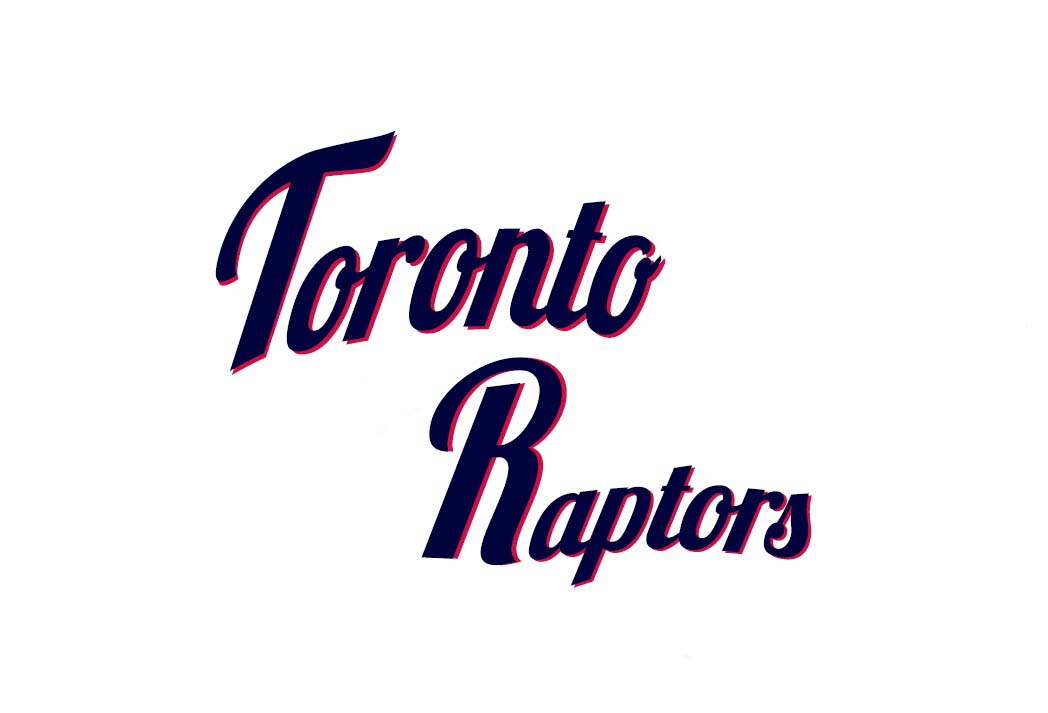
We’ve redrawn the Raptors vintage text from the ground up and made subtle changes to the shapes of the lettering.
I know Tim Leiweke wanted to have a Canadian element to the brand so we’ve also included a maple leaf between the text and head.
The head inspiration was drawn from graphic novels to give it a very gritty look with the white eyes and under-bite. We also wanted to have the head more like a real Raptor head which is longer than the current design (more T-Rex shaped).
Poll