Could this be a peek into the future of basketball in Toronto?
Friday afternoon, the Toronto Raptors Twitter account shared the following link.
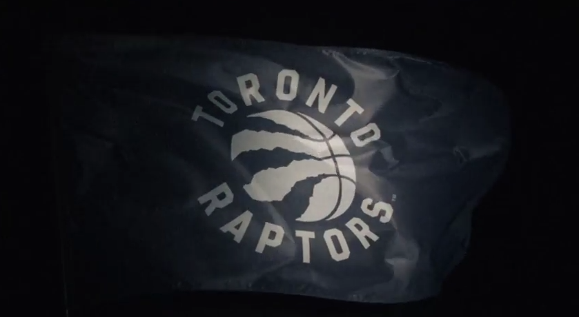
On the surface, it looks as if the Raptors simply piggybacked off their wildly successful “We The North” marketing campaign, stirring “This is our shield” into an already bubbling pot, but at the very end, a flag bearing a new Raptors logo was shown. This is of interest, as the Raptors are known to be planning a brand redesign, which is scheduled to drop in 2015-2016.
For what it’s worth, the Toronto Raptors’ official Facebook account also posted the same logo.
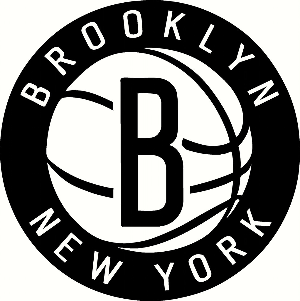
Personally, I’m a fan of the circular design and the black and white color scheme. It looks a lot like Brooklyn’s logo, which is just a bit confusing, but overall the setup looks pretty slick. It’ll be a shame if the purple and red are buried as a result, but this new look is fully aligned with the We The North slogan, which is something, I guess.
Update: Red ain’t dead?
Came across something on Twitter (via Marc Woizinski), which might suggest that the Raptors’ red isn’t out of the picture quite yet. If my intuition is correct, every team is required to have three official colors, in which case black and white would not be enough.
@WolstatSun @ekoreen the facebook page had a colour version but took it down pic.twitter.com/gEWNZfMgBN
— Marc Woizinski (@_Marc_W) December 19, 2014
Update (redux): Wolstat confirms rebrand
That is indeed the Raptors re-brand, but will be more colourful. Not sure if in stores in time for Christmas.
— Ryan Wolstat (@WolstatSun) December 19, 2014
Your thoughts?
UPDATE: RAPTORS CONFIRM
Now that we've got your attention… pic.twitter.com/kJ8peohItE
— Toronto Raptors (@Raptors) December 19, 2014


